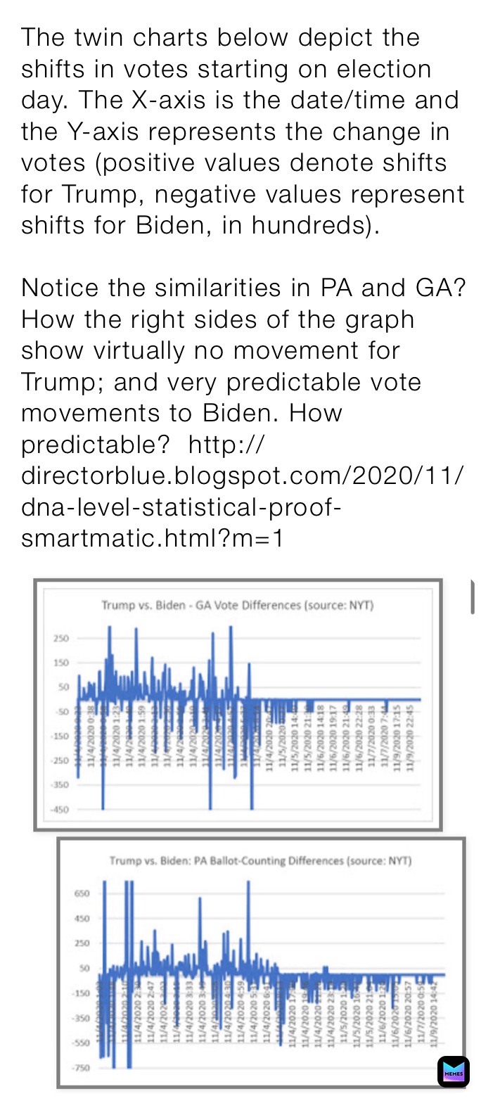
The twin charts below depict the shifts in votes starting on election day. The X-axis is the date/time and the Y-axis represents the change in votes (positive values denote shifts for Trump, negative values represent shifts for Biden, in hundreds).
Notice the similarities in PA and GA? How the right sides of the graph show virtually no movement for Trump; and very predictable vote movements to Biden. How predictable? http://directorblue.blogspot.com/2020/11/dna-level-statistical-proof-smartmatic.html?m=1
Notice the similarities in PA and GA? How the right sides of the graph show virtually no movement for Trump; and very predictable vote movements to Biden. How predictable? http://directorblue.blogspot.com/2020/11/dna-level-statistical-proof-smartmatic.html?m=1


